The Pre-Press Checklist Every Designer Should Keep at Their Desk

Every experienced designer has a story. A brochure delivered with text uncomfortably close to a trimmed edge. A business card where the rich black headline printed as a muddy gray. A product label where the client's logo appeared in an unexpected shade because the file was submitted in RGB rather than CMYK. These are not rare catastrophes — they are the predictable consequences of skipping steps in the pre-press process.
At Print Magic Print, we have partnered with designers, marketing teams, and business owners across the United States on thousands of custom print projects. The single most consistent factor separating flawless outcomes from frustrating reprints is preparation. The checklist that follows consolidates the essential steps every print project demands, organized in the sequence you should address them.
Step 1: Confirm the Final Dimensions and Document Setup
Before any design work begins — or before any file is finalized for submission — confirm the exact trim dimensions of the finished piece with your print provider. A business card in the United States is typically 3.5 by 2 inches at trim. A standard brochure panel measures 3.67 by 8.5 inches when folded to a trifold format. These are conventions, not universal rules, and your specific project may deviate.
Once dimensions are confirmed, set up your document at the correct size in your design application. Do not design at a different scale and resize before export — this workflow introduces rounding errors and can subtly shift element placement.
Checklist items:
- Document canvas matches confirmed trim dimensions
- Units are set to inches (or points, if your workflow requires)
- Orientation is correct (portrait vs. landscape)
Step 2: Establish Bleed and Safe Zone Parameters
Bleed refers to the extension of background colors, images, or design elements beyond the trim edge of a document. Because cutting equipment operates with a small margin of mechanical variance, any design element that is intended to reach the edge of a finished piece must extend beyond it — typically by 0.125 inches (one-eighth inch) on all sides for most US print applications.
Equally important is the safe zone: an inward margin, typically 0.125 to 0.25 inches from the trim edge, within which all critical content — text, logos, essential imagery — should be contained. Elements placed too close to the trim risk being partially cut off in the finishing process.
Checklist items:
- Bleed of at least 0.125 inches applied on all sides
- Safe zone margin established and respected
- Background elements extended fully into bleed area
- No critical text or logos placed outside the safe zone
Step 3: Verify Color Mode and Color Values
This is the step most frequently overlooked by designers who primarily work in digital environments. Print uses the CMYK color model. Files submitted in RGB may be converted automatically by print software, but automated conversion rarely produces results that match the designer's intent — particularly for brand-specific colors.
Convert your document to CMYK before finalizing design decisions. Colors that appeared vibrant on screen may shift noticeably in CMYK, and it is far preferable to discover and address this during the design phase than after submission.
For rich black — a deep, saturated black appropriate for large headline text or solid black backgrounds — use a CMYK build of approximately C:60 M:40 Y:40 K:100. Pure K:100 black (sometimes called flat black) is appropriate for small body text and fine lines, where a rich black build can cause registration issues.
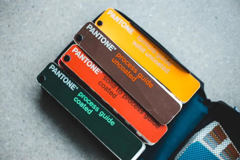
If your project requires Pantone color matching, document the specific PMS codes and communicate them explicitly to your print provider.
Checklist items:
- Document color mode set to CMYK
- All placed images converted to CMYK
- Rich black formula applied to large solid black elements
- Pantone references documented where applicable
- No spot colors unintentionally included in the file
Step 4: Check Image Resolution
Resolution requirements for print differ significantly from screen. While 72 pixels per inch (PPI) is adequate for web display, print demands a minimum of 300 PPI at the final output size. Images sourced from websites, social media, or low-resolution exports will appear noticeably soft or pixelated when printed, particularly at larger formats.
Verify the resolution of every placed image in your layout. In Adobe InDesign, the Links panel displays the effective PPI of each image at its current placement size — a useful reference. Note that scaling an image up within your layout reduces its effective resolution; an image that is 300 PPI at 100 percent scale becomes 150 PPI when scaled to 200 percent.
Checklist items:
- All images at minimum 300 PPI at final output size
- No images scaled beyond their native resolution
- Rasterized elements (textures, effects) rendered at print resolution
- Images are not upsampled from low-resolution originals
Step 5: Address Typography and Font Handling
Fonts present two common categories of risk in print production. The first is missing fonts — files submitted without the necessary fonts embedded or outlined may substitute default system fonts, altering your layout in ways ranging from subtle to dramatic. The second is overly small type, which can become difficult to read when printed, particularly in light colors on dark backgrounds or in reverse (white text on a colored field).
Outlining all fonts before final export converts text to vector paths, eliminating font dependency entirely. Alternatively, embedding fonts during PDF export achieves the same protective result for most workflows.
As a general guideline, body text should be set no smaller than 7 to 8 points for standard commercial printing. Reversed text (light on dark) typically requires slightly larger minimum sizes to remain legible.
Checklist items:
- All fonts outlined or embedded in the export
- Minimum type size appropriate for the application
- Reversed text reviewed for legibility
- No fonts referenced from network or cloud locations
Step 6: Inspect for Overprint and Transparency Issues
Overprint settings control whether overlapping colored elements mix optically in printing or whether the top element knocks out the element beneath it. Accidental overprint settings — particularly on black text — can cause text to disappear against dark backgrounds or produce unexpected color interactions.
Transparency effects (drop shadows, feathered edges, opacity reductions) must be properly flattened before output. While modern PDF workflows handle transparency well, it is worth confirming with your print provider which PDF standard they prefer — PDF/X-1a requires full flattening, while PDF/X-4 supports live transparency.
Checklist items:
- Overprint settings reviewed in the Attributes panel
- Black text set to knock out (not overprint) where appropriate
- Transparency effects reviewed and flattened if required
- PDF exported to the standard specified by your print provider
Step 7: Request and Review a Physical Proof
A PDF soft proof is a useful early-stage review tool, but it cannot substitute for a physical proof on the actual substrate. Colors, contrast, and fine detail all behave differently on paper than on a calibrated monitor. Before approving any significant print run, request a hard-copy proof — sometimes called a press proof or contract proof — from your print provider.
Review the physical proof under consistent lighting. Check color accuracy against your brand standards, verify that all text is legible, confirm that bleed extends to the edge of the proof, and examine fine details such as hairline rules and small logos.
Checklist items:
- Physical proof requested prior to full run approval
- Color accuracy verified against brand standards
- All text and fine detail reviewed at full size
- Bleed, trim, and fold lines confirmed
- Written approval documented before production proceeds
A Final Word on Preparation
The investment of time required to work through this checklist is modest compared to the cost — financial and otherwise — of a reprinted job. At Print Magic Print, our team is available to review files and identify potential issues before production begins. A well-prepared file is the foundation of a successful print project, and the care taken in pre-press is invariably reflected in the quality of the finished piece.