How Color Choices in Print Shape the Way Customers See Your Brand
Before a potential customer reads your tagline, absorbs your value proposition, or even registers your company name, their brain has already formed an opinion — and color is the primary driver of that snap judgment. Research consistently demonstrates that color accounts for up to 90 percent of an initial impression made within the first 90 seconds of visual contact. For businesses investing in custom printed materials, this statistic carries profound implications.
At Print Magic Print, we work with businesses and creative professionals across the United States who understand that print is a tactile, enduring medium. Unlike a website that can be updated overnight, a printed brochure, business card, or product package represents a commitment. Getting the color strategy right from the outset is not merely a design preference — it is a business imperative.
The Emotional Architecture of Color
Color psychology is the study of how hues influence human behavior and emotional response. While individual reactions to color can vary based on personal experience and cultural background, broad patterns emerge across large populations that marketers and designers rely upon.
Blue, for instance, is the dominant color in financial services and healthcare branding in the United States — think of institutions like JPMorgan Chase or the imagery associated with medical providers. It communicates reliability, calm, and trustworthiness. Red, by contrast, creates urgency and stimulates appetite, which explains its prevalence in the food and beverage sector. Yellow signals optimism and accessibility, while green has evolved to carry dual associations: environmental responsibility and financial prosperity.
For printed materials specifically, these associations carry heightened weight. A brochure sits in a prospect's hands. A business card rests on a desk. A product package occupies shelf space alongside competitors. The color choices you make in each of these contexts either reinforce your brand narrative or undermine it.
Screen Color vs. Print Color: A Critical Distinction
One of the most common and costly mistakes businesses make is designing for digital screens and assuming the results will translate seamlessly to print. They will not — at least not without deliberate preparation.
Digital displays use the RGB (Red, Green, Blue) color model, which generates color through light emission. Print, on the other hand, relies on CMYK (Cyan, Magenta, Yellow, Black) — a subtractive color model that works by absorbing light through ink layers on paper. The gamut, or range of reproducible colors, differs significantly between these two systems.
Vibrant neon greens, electric blues, and certain luminous purples that look striking on a monitor may appear muted, darker, or subtly shifted when rendered in ink on paper. This is not a flaw in the printing process — it is a fundamental characteristic of how physical ink interacts with light.
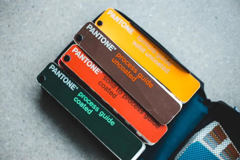
The solution is to work in CMYK from the earliest stages of design when creating print-specific materials. Additionally, referencing a Pantone Matching System (PMS) guide allows designers and print professionals to specify exact ink formulations, ensuring consistency across print runs regardless of the printing equipment used. At Print Magic Print, our team routinely guides clients through color space conversion to prevent unwelcome surprises at the proof stage.
Real-World Brand Color Strategies Worth Examining
Consider the evolution of Tiffany & Co. The brand's signature robin's-egg blue — formally known as Tiffany Blue, or Pantone 1837 — is so precisely controlled and legally protected that it functions as a standalone brand asset. The color appears on boxes, bags, and printed inserts with absolute consistency. That consistency, maintained rigorously across both print and digital channels, has made the color itself a symbol of luxury and aspiration in the American consumer consciousness.
Another instructive example is the use of black and white minimalism by premium technology brands. By stripping away color in packaging and printed collateral, these companies communicate sophistication and confidence — an implicit message that their product requires no embellishment to impress.
For small and mid-sized businesses, the lesson is not to replicate these specific palettes but to understand the intentionality behind them. Every color choice should serve a purpose rooted in your target audience's psychology and your brand's core values.
Choosing the Right Palette for Business Cards, Brochures, and Packaging
Different printed formats call for different color considerations.
Business Cards: This small format benefits from restraint. A dominant brand color paired with a neutral — typically white, cream, or charcoal — tends to read with greater clarity and professionalism than a card crowded with multiple competing hues. Consider how the color will appear against the card stock itself; uncoated paper absorbs ink differently than gloss or matte laminated finishes, which can affect perceived saturation.
Brochures: Here, color hierarchy becomes essential. A primary brand color should anchor the design, while secondary tones guide the reader's eye through informational sections. Avoid using more than three to four distinct colors in a single brochure layout, as visual complexity can undermine readability and dilute brand cohesion.
Packaging: Product packaging operates in a competitive environment — the retail shelf or the unboxing moment. Color must differentiate your product while remaining consistent with your overall brand identity. Earth tones and kraft paper aesthetics signal sustainability and artisan quality. Bold, high-contrast color combinations suggest energy and innovation. The finish of the packaging — gloss, matte, soft-touch laminate — also interacts with color in meaningful ways, altering how saturated or premium a hue appears to the eye.
Practical Steps for Color-Confident Print Projects
For businesses preparing to invest in custom print materials, the following guidance will help ensure color accuracy and strategic alignment.
First, define your brand color palette using specific CMYK values and, where budget permits, corresponding Pantone references. Document these values in a brand style guide so that all future print vendors — including your team at Print Magic Print — can match them precisely.
Second, always request a physical proof before committing to a full print run. A digital PDF proof is useful for layout review, but only a printed proof on the intended substrate reveals how color will truly behave in the final product.
Third, consider how your colors will perform across different paper stocks and finishes. Request sample swatches from your print provider and view them under the lighting conditions where the materials will typically be seen — whether that is fluorescent office lighting, natural daylight, or retail display illumination.
Finally, revisit your color strategy periodically. Consumer associations with color shift over time, and what communicated innovation a decade ago may now feel dated. A thoughtful refresh of your printed materials, guided by current research and professional color expertise, can reinvigorate your brand's visual impact.
Color is not decoration. In print, it is communication — and when executed with intention and precision, it is among the most powerful tools available to any business seeking to make a lasting impression.