The Weight of First Impressions: How Paper Stock Transforms Print From Forgettable to Unforgettable
There is a moment — brief, almost unconscious — that occurs every time someone picks up a printed piece. Before a single word is read, before a color registers, the hand sends a signal to the brain. Is this worth my attention? The answer, more often than not, is determined not by the design alone, but by the physical substance beneath it.
Paper weight is one of the most underestimated variables in print production. Businesses routinely invest in sophisticated design, professional photography, and precision color matching, only to undercut the entire effort by printing on stock that feels thin, flimsy, or generic. The result is a piece that communicates the opposite of its intended message — regardless of how polished it looks on screen.
Understanding how paper weight functions as a marketing tool is not a luxury for large agencies. It is a practical discipline that every business, from independent creative professionals to enterprise marketing teams, can and should apply.
Understanding the Numbers: What Paper Weight Actually Means
In the United States, paper weight is expressed in pounds (lb) and measured using a system that, frankly, confuses many buyers the first time they encounter it. The weight designation refers to the mass of 500 sheets of paper cut to a specific standard size — and that standard size differs depending on the paper category. This is why a 60 lb text stock and a 60 lb cover stock feel dramatically different in your hand: they are measured against different base sheet dimensions.
For practical purposes, the most useful distinction is between text weight and cover weight papers.
- Text weight (typically ranging from 60 lb to 100 lb) is used for interior pages, brochures, flyers, and stationery. It is flexible and designed to accept ink with high fidelity across large surface areas.
- Cover weight (typically ranging from 80 lb to 130 lb) is denser, stiffer, and used for business cards, postcards, folder covers, and any application where rigidity and durability are priorities.
For reference, standard office copy paper sits around 20 lb bond, or roughly 50 lb text. A business card printed on 16 pt cover stock — a common premium specification — is nearly four times as thick.
The Psychology of Touch in Marketing
Research in haptic psychology has consistently demonstrated that physical texture and weight influence perceived value. A study frequently cited in marketing literature found that subjects rated products as higher quality when they were presented in heavier packaging — even when the products themselves were identical. This effect, sometimes called the "weight heuristic," is deeply embedded in human cognition.
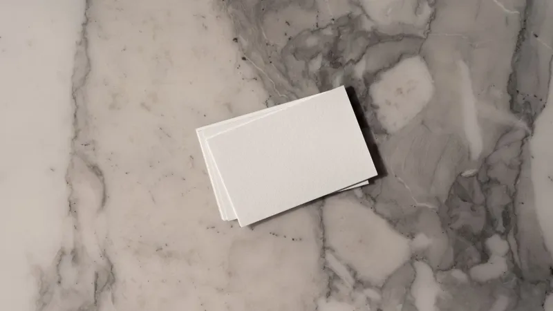
In print marketing, this translates directly. A business card printed on 14 pt or 16 pt cover stock with a soft-touch matte laminate does not merely look premium — it feels premium, and that sensation reinforces the message your brand is trying to convey. Conversely, a card printed on thin, uncoated stock may be technically readable but communicates an unintended message about the business behind it.
Texture adds another layer to this equation. Uncoated stocks feel natural and approachable, often associated with sustainability and craftsmanship. Gloss-coated stocks convey vibrancy and modernity. Soft-touch finishes — achieved through a specialized matte laminate — have become a popular choice among luxury brands and creative agencies precisely because they create a tactile experience that is both sophisticated and memorable.
Stock Recommendations by Use Case
Selecting the right paper is not a one-size-fits-all exercise. The appropriate stock depends on the function of the piece, the environment in which it will be handled, and the brand impression you intend to leave.
Business Cards
The business card may be the most high-stakes print piece in any professional's arsenal. It changes hands in a moment of introduction, often under competitive circumstances. A minimum of 14 pt cover stock is recommended for standard business cards, with 16 pt being the preferred choice for a noticeably substantial feel. Professionals in creative fields — designers, photographers, architects — frequently opt for specialty stocks such as duplex (two sheets laminated together for extreme thickness), cotton-fiber paper, or uncoated textured stock to differentiate themselves further.
Brochures and Marketing Collateral
For tri-fold or bi-fold brochures, 100 lb gloss or matte text strikes the right balance between flexibility (necessary for folding) and perceived quality. If the brochure is intended to function as a leave-behind that will be retained and referenced — such as a product catalog or service menu — upgrading to 100 lb cover for a single-fold format adds durability without sacrificing the fold.
Packaging and Presentation Folders
Packaging demands structural integrity. Folding cartons and presentation folders typically require 18 pt to 24 pt paperboard, with coatings selected based on whether the application needs to withstand handling, moisture, or display conditions. A soft-touch laminate on a presentation folder used at a trade show, for example, will hold up through repeated handling while reinforcing a polished brand experience.
Direct Mail Postcards
Direct mail pieces face a unique challenge: they must survive postal handling and still arrive looking intentional rather than incidental. 14 pt cover stock is the industry standard for postcards, though some mailers upgrade to 16 pt for campaigns targeting high-value prospects, where the incremental cost is justified by the elevated first impression.
Real-World Impact: When Stock Upgrades Change Campaign Outcomes
The case for investing in premium stock is not purely theoretical. Consider a mid-sized architecture firm that historically printed its client proposal packets on standard 80 lb text — a serviceable choice that blended into the background. After consulting with a print production specialist, the firm transitioned to 100 lb uncoated text for interior pages and 130 lb matte cover for the outer shell, with a subtle embossed logo on the front panel.
The response from prospective clients was immediate and consistent: the proposals were described as "different," "impressive," and — critically — "the kind of thing you keep on your desk." The firm reported a measurable uptick in proposal-to-contract conversion rates in the months following the change. No other variable in the proposal had been altered.
Similarly, a consumer goods brand that upgraded its product hang tags from 10 pt to 16 pt coated stock found that retail buyers commented on the perceived quality of the packaging before the product itself was discussed — a powerful reminder that print materials shape perception before the core message is even delivered.
Making the Investment Work for Your Budget
One of the most common hesitations around premium stock is cost. It is true that heavier, specialty papers carry higher per-unit prices than commodity stock. However, the relevant calculation is not cost-per-piece in isolation — it is cost relative to the value of the impression being made.
For a business card distributed to high-potential clients, the difference between 14 pt and 16 pt cover stock may amount to a few cents per card. Weighed against the potential lifetime value of a single converted client, that margin is almost always justified. For larger-format pieces where paper costs are more significant, selective upgrading — prioritizing cover stock for the outer shell while using standard text weight inside — can deliver much of the tactile benefit at a manageable cost.
Working with an experienced print partner to specify stock accurately also helps avoid the common pitfall of ordering a paper that looks appropriate on a specification sheet but does not behave as expected in production. Variables such as ink absorption, fold performance, and coating compatibility all interact with paper weight in ways that require production expertise to navigate confidently.
The Takeaway
Print materials are physical objects that exist in the world, handled by real people who form real impressions in a matter of seconds. The weight and texture of the stock on which those materials are produced is not a secondary concern — it is an integral part of the message. Choosing the right paper is choosing how your brand feels, and that is a decision worth making with intention.